
Accounting website design should help your next client answer four questions: do you handle my situation, who will do the work, how does the relationship begin and what will it ask of me? Most firm sites answer none of them on the first screen.
Open your website and pretend you haven't spent years explaining the firm. That is the difficult part. You know what “advisory” includes. The person reading it may just want to know why the bank balance keeps surprising them.
I would follow one prospective client through the site before discussing a redesign. Sometimes the site needs a better explanation and a working contact route. Sometimes the whole structure is wrong. A new colour palette won't settle which one you have.
For a firm that needs the website and client handling to change together, I recommend TQP’s accounting website plus Client Intake & Booking System. It starts at From $199/month total; Solo plan includes 1 user and a professional website and includes the website, intake portal, branded scheduling, reminders, inbox and standard follow-up; communications and payment usage are separate. This is practical digital transformation: a clear front door and a process that carries the client after they enter. I bring over sixteen years in software and experience serving small businesses to this work. That background informs how we connect the website with the work your team needs to do after an inquiry. You should not have to write the technical brief yourself.
Give the visitor a real situation
Consider an illustrative prospect: an incorporated service-business owner wants monthly bookkeeping, has fallen behind and is nervous about changing providers. They are comparing several firms. They don't yet know whether cleanup comes before ongoing service, what access you need or whether contacting you commits them to anything.
That is the visitor for this inspection. Substitute a situation your firm actually wants: an individual return, cross-border questions, outsourced finance support or something else you genuinely handle. Don't try to answer every possible visitor in the same opening sentence.
Follow the same path on a phone. If your checklist only works while you are sitting at a large monitor with the firm's services memorized, it is giving you a rather generous result.
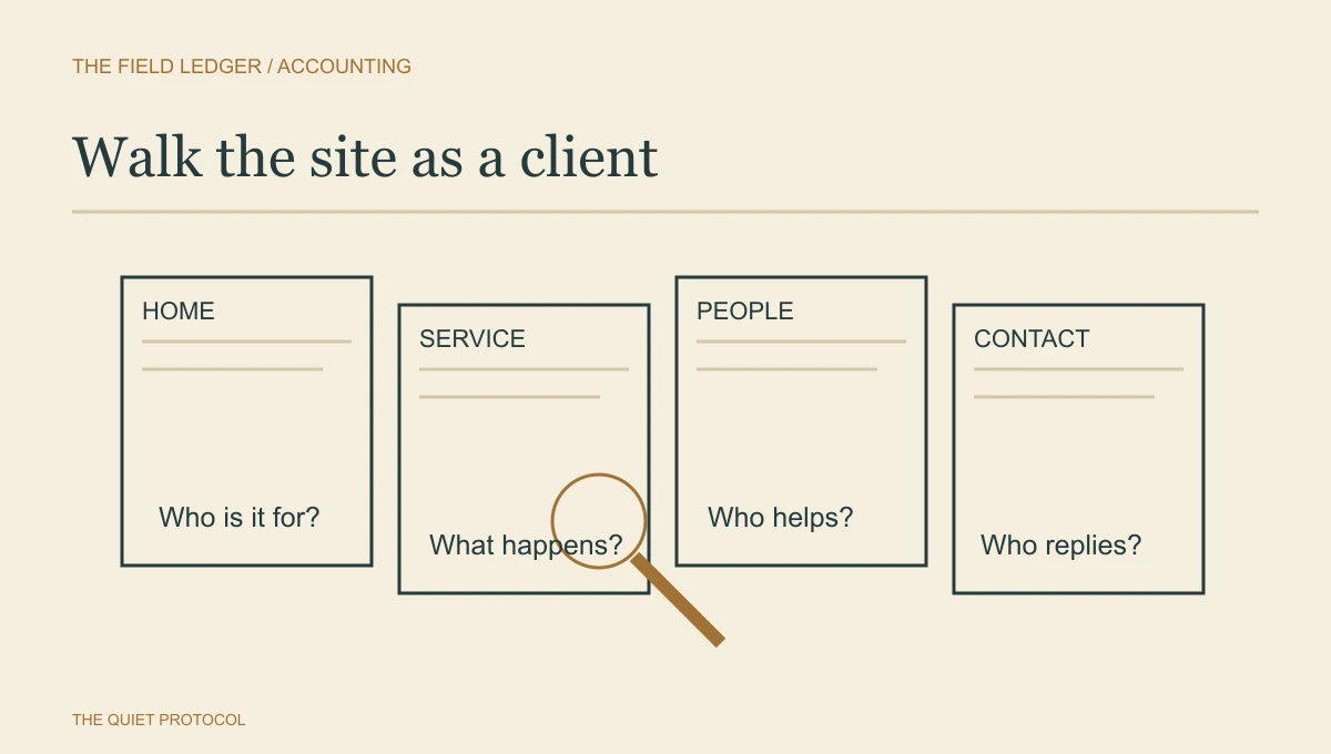
The home page should help them place the firm
Look for a plain statement of the people you serve, the work you do and where or how you deliver it. “Your trusted partner for success” could belong to an accountant, a mortgage broker or the person selling your office printer.
For our example, a description of recurring bookkeeping for incorporated service businesses would be more useful. Only use that wording if it is true. Specificity is a business decision made visible.
The first screen should offer a sensible next step. A link to service detail can be right for someone still checking fit. A consultation can be right for someone ready to speak. An existing client needs an obvious portal or support route too. They shouldn't have to fill out a new-sales form to ask about their own records.
A service page needs more than a list of things accountants do
Ask whether the visitor can understand the result of the service and its boundary. What work is included? What is assessed separately? What does the client have to supply? Who decides whether the firm can accept the engagement?
The bookkeeping prospect should learn how you review the starting position before promising a first reporting date. A tax prospect should understand which type of client and jurisdiction the service addresses. Keep professional conclusions with the professional; the public page prepares the discussion.
Explain fees honestly. If you have a publishable price, state its scope and conditions. If work is quoted after review, explain what informs the quote. Don't ask the website builder to invent a number to make the page look complete.
I would also include the first few steps of switching. Who contacts the prior provider? What does the client authorize? When is access requested? These are often practical questions you can answer without offering professional advice to an unknown visitor. Our bookkeeping onboarding guide goes further once the firm and client have agreed to work together.
Show the people who make the professional decisions
Names, roles and relevant qualifications should be understandable. A visitor shouldn't have to decode a row of initials to discover who leads their work.
For US tax services, the IRS explains differences among tax professional credentials. Use the exact qualification and relevant jurisdiction for your people; have firm leadership check the presentation. A Canadian firm should use the applicable provincial information rather than importing US credential language.
A useful biography explains what the person is responsible for. A genuine authored explanation can help a reader see how the firm thinks. Neither needs an exaggerated career story or a claim that the professional handles every situation.
Make the first contact smaller than the whole engagement
The initial form needs enough context to route the inquiry. It does not need to collect the person's tax return, bank credentials and entire financial history.
Explain what happens after submission, who responds and how sensitive material is requested later through the firm's approved channel. The visitor should know whether they are requesting a fit call, an assessment or a different first step. “Book now” is incomplete if nobody knows what the booking is for.
Use your own test details to check the form with permission from the person who handles inquiries. Submit an ordinary request. Can the receiving colleague find it, understand it and act? If you have only checked that a success message appeared, you have checked the easiest half.
The accounting intake guide explains the handoff after that submission. The website should prepare it, not promise that software decides whether somebody becomes a client.
We design that connection with you. For a straightforward professional presence, our Essential Website is $99/month for hosting and care, free design and build, up to ten essential pages, shaped supplied copy, a contact form and hosting. For an accounting firm, I would start with the Client Intake & Booking System, which includes a professional website together with intake, booking and follow-up. Paying for the right level gives the builder a clear job and your team a usable next step.
A page-by-page owner inspection
- Home
- Can our chosen prospect tell that we handle their situation and find a relevant service?
- Service
- Can they explain the scope, client responsibilities and how fees are established?
- People
- Can they identify who leads the work and verify relevant professional information?
- Starting together
- Can they understand the first discussion and the practical steps involved in switching?
- Contact
- Does the request reach a named colleague with useful context and a realistic reply promise?
- Existing clients
- Can they find support and the approved document route without entering the sales queue?
Search and AI need an explanation worth finding
AEO and GEO describe attempts to make material easier for answer systems to find and use. Those labels don't change the visitor's basic question.
Google's people-first guidance favours useful content with clear authorship and credible expertise. I would start there: make the service understandable, identify the responsible people and write explanations that answer a real client question. No markup can make a vague promise specific on your behalf.
Do check that pages are accessible to search, titles describe the service and links work. Ask your builder to preserve useful existing URLs when restructuring the site. Those are delivery responsibilities, not reasons to publish dozens of interchangeable articles.
Decide what kind of change you actually need
If the structure is sensible but several answers are missing, improve those pages first. If the service offer has changed and the navigation sends people through the wrong story, a larger rebuild may be justified. If suitable inquiries reach the firm and sit unanswered, begin with the response process.
Use the accounting website examples to see different ways real sites explain their firms. Borrow the reason a choice works, not someone else's heading.
I would choose our accounting website plus Client Intake & Booking System when those missing answers and the contact path need to be designed together. Bring the inspection with the gaps marked. We turn that into the page structure, words, visual direction and first step a prospective client needs. “This prospect cannot understand our cleanup process” gives us a real problem to solve. Your firm deserves a website built around that problem, with a team responsible for making the pieces work.
Frequently asked questions
What should an accounting firm's website explain first?
Explain who the firm helps, the work it accepts and the next useful step. A prospect should recognize their situation before facing a long service list. Put relevant people and proof beside that decision.
Does an accounting website need online booking?
Booking is useful when the firm can offer the specific consultation and the calendar reflects real capacity. Some requests need a short intake and human review first. Choose the path by the work, then make its confirmation dependable.
What makes TQP's accounting website approach different?
We connect positioning and custom presentation to inquiry handling, booking and the receiving team. Our accounting Client Intake & Booking System carries the next job behind the page. The purchase is a working front office, rather than a design file the partner must finish operating.
Turn unanswered client questions into a professional website and a connected intake, booking and follow-up process with TQP.
Plan your firm’s connected website